2026-05-15
Mineral water labels sit right in front of customers in stores and give them important details at a glance. These labels mix facts with visual appeal, helping people decide which bottle to take home. Brands spend time arranging every part so the information feels clear and the overall look matches the product inside.
Most mineral water labels show where the water comes from, including the spring name and its location. They list common minerals like calcium, magnesium, and sodium, along with the total dissolved solids. Shoppers often look for this section to understand the water’s natural makeup.
Bottlers usually include the bottle volume, any basic treatment notes, and a clear best-before date. Some labels mention pH value in simple terms. All these details appear in spots that are easy to spot when bottles line up on shelves.
Factories choose label materials that handle cold temperatures and moisture without peeling or fading. Coated paper remains a common option because it prints well and feels smooth. Some companies prefer thin plastic films that wrap around the entire bottle for a seamless look.
The adhesive holds tight during transport but allows recycling processes later. Printing uses methods that deliver sharp text and steady colors even on fast production lines. These choices help the label stay neat from the factory all the way to store shelves.
Labels look a bit different depending on the bottle size. Small portable bottles use tighter layouts with only the most needed information. Larger bottles have more room and sometimes show extra details about the water or simple usage suggestions.
Multi-packs and family sizes often carry matching label styles across the group. Travel versions keep things minimal so the label does not feel crowded. These small adjustments help brands organize their full range while keeping the main look consistent.
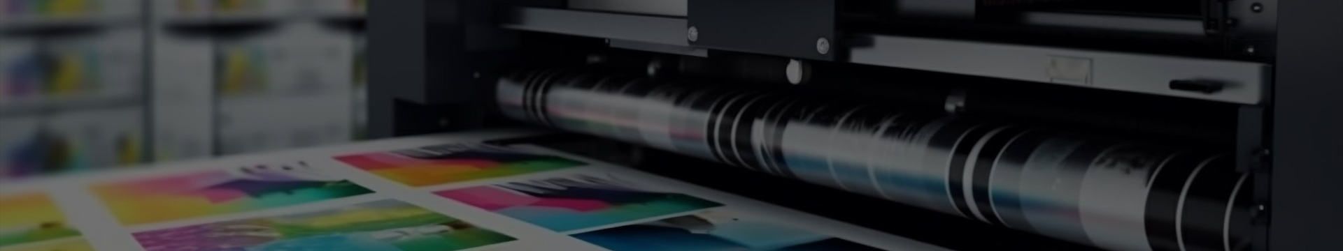
Creating mineral water labels starts with designers laying out the graphics and text. Once approved, the designs go to high-speed printers that produce large volumes in a short time. Regular checks during printing catch any color shifts or blurry text early.
After printing, a protective layer goes on to guard against scuffs. Machines then apply the labels straight and smooth as empty bottles move quickly down the line. The whole process runs so each bottle ends up with an evenly placed label.
Brands develop their own label styles that shoppers start to remember over time. Repeating certain colors, shapes, or icons across different sizes builds familiarity. Some lines introduce small design updates for special batches while keeping the core elements the same.
This approach helps products stand out when many similar bottles sit together in the cooler section. The label becomes something people notice first and connect with the water they prefer.
People scan mineral water labels quickly when shopping. Some check the mineral content because they want water with certain natural levels. Others simply look at the origin or pick based on how clean and attractive the label appears.
Good label design makes this process easier. Logical placement of text and decent size lettering help shoppers find what they need without struggling. Many people make their choice in just a few seconds based on what they see on the front and back.
Recommended Products
CONTACT US
Add: Rooms 101 and 102, Building 16, Longcheng Micro-Entrepreneurship Park, Longgang City, Wenzhou City, Zhejiang Province, China
TEL: +86-13395775085
E-mail: [email protected] / [email protected]
KEEP In Touch
 English
 русский
 Español