2026-10-02
The appearance of bottled water continues to attract attention in the beverage packaging market, with the mineral water label playing an important role in how a product is presented. Although the bottle contains a familiar everyday drink, its label can introduce visual character, provide product information, and create a recognizable connection between the bottle and its brand.
A mineral water label is more than a printed piece attached to a bottle. It works together with the bottle shape, cap, color, and overall packaging style. A well-planned label can make a simple bottle look distinctive while keeping important information easy to find.
Designers can use different layouts, typography, illustrations, patterns, and background elements to create a particular visual style. Some brands choose a clean appearance with limited graphics, while others use stronger colors and decorative details to create a more energetic look.
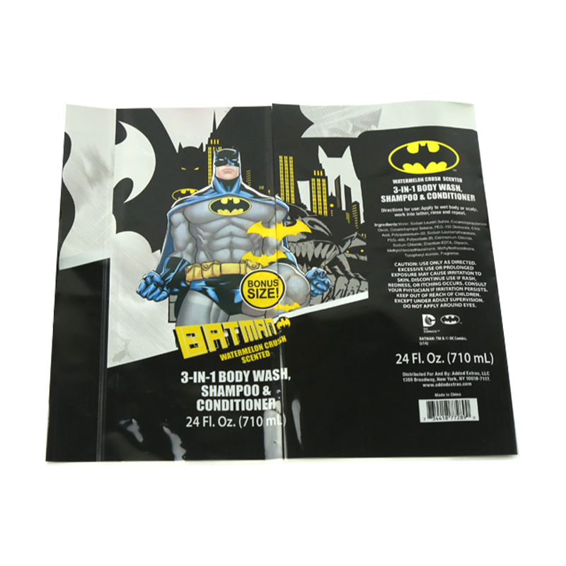
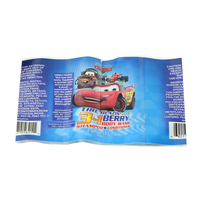
Material selection is another consideration when developing a mineral water label. Depending on the packaging design and production requirements, labels may use paper-based materials, synthetic films, or other specialized label substrates.
Each material can create a different visual and physical impression. A smooth surface may support sharp printed graphics, while a textured material can give the packaging a more distinctive feel. Transparency can also be used to create a connection between the label and the bottle underneath.
Color is closely connected with beverage packaging. Blue, white, green, silver, and other shades are frequently seen in mineral water label designs, but brands can also explore different color combinations to create their own visual identity.
A consistent color approach can help consumers recognize a product when several bottles are displayed together. Color can also be combined with typography and graphic elements to create a clear relationship between different products within the same brand.
A mineral water label needs to balance visual presentation with readable information. Product names, brand marks, water descriptions, volume details, and other relevant content can be arranged through different text sizes and positions.
Clear typography can make information easier to locate, while carefully selected graphic elements can prevent the label from looking crowded. This balance is particularly important for bottles displayed in supermarkets, restaurants, hotels, offices, and other everyday settings.
Bottle labels can also be customized for different sales channels and customer groups. A company may use one design for regular retail products and another visual style for hospitality applications or promotional packaging.
For manufacturers, printing suppliers, beverage companies, and packaging distributors, customization can include label dimensions, colors, finishes, graphics, and text arrangements. These options allow the same general product category to support a range of packaging concepts.
The mineral water label may occupy only part of a bottle, but it has a noticeable influence on the product's appearance. From material and color to typography and layout, multiple design elements come together to create the final package.
As bottled water remains a familiar product in daily life, label design continues to provide brands with a practical way to communicate identity and organize product information. For packaging buyers and beverage businesses, understanding the different possibilities of mineral water label design can help them develop packaging that fits their product concept and target market.
Recommended Products
CONTACT US
Add: Rooms 101 and 102, Building 16, Longcheng Micro-Entrepreneurship Park, Longgang City, Wenzhou City, Zhejiang Province, China
TEL: +86-13395775085
E-mail: [email protected] / [email protected]
KEEP In Touch


 English
 русский
 Español