2026-07-10
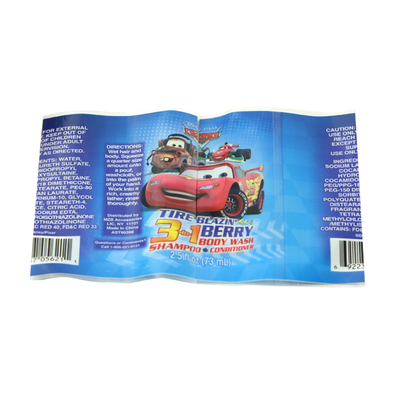
A typical mineral water label includes details such as the source of the water, mineral content, and basic production information. Manufacturers list the volume of the bottle and any relevant nutritional facts. This setup helps shoppers understand what they are buying without needing extra explanation. The layout usually places the brand name prominently at the top or center, with supporting text arranged in clear sections.
Designers often choose fonts that remain easy to read even when the bottle sits in a refrigerator or on a store display. Colors tend toward blues and greens, which many people connect with freshness and natural origins, though variations exist depending on the brand’s approach. Some labels incorporate subtle patterns or textures that add visual interest without overwhelming the main message.
Effective mineral water labels prioritize clarity over decoration. Text sizes vary to create a natural flow from the most important details down to supporting information. White space around elements prevents the label from feeling crowded. Many designers test different versions to see how the label performs under various lighting conditions and angles.
Materials also play a part. Some labels use coated paper that resists moisture, ensuring the design stays intact even when bottles condense in cool environments. Others opt for thinner films that wrap smoothly around curved surfaces. These practical decisions help the label remain useful throughout the product’s shelf life.
Companies use mineral water labels to express their approach without relying on lengthy descriptions. A label might highlight the region where the water comes from through a small map or simple illustration. Others focus on the purity of the source with clean lines and minimal text.
This visual communication helps bottles stand apart in crowded coolers. Shoppers often make quick decisions based on the label’s appearance, so designers aim for consistency across different bottle sizes within the same product line. The result is a cohesive look that customers can recognize from a distance.
Recent years have seen a move toward straightforward designs that emphasize transparency. Labels often feature larger text for mineral content and origin details. Some incorporate QR codes that lead to additional information online, though the physical label itself remains self-contained for basic needs.
Printing techniques now support finer details, such as embossed logos or soft-touch finishes that invite touch. These small enhancements can make the bottle feel more premium while still delivering the core facts consumers expect. Digital design tools allow for faster iterations, meaning companies can adjust labels based on feedback from test markets.
On store shelves, mineral water labels help organize products visually. Uniform sizing and placement of key information allow shoppers to scan rows of bottles efficiently. Eye-catching yet balanced designs draw attention without creating visual clutter in the beverage section.
In marketing materials and social media posts, these labels often feature prominently because they translate well into photographs. The combination of text and imagery tells a complete story in a single glance. This visual efficiency benefits both sellers and buyers in fast-paced retail environments.
Mineral water labels continue to evolve as packaging technology advances, yet their core purpose remains steady: delivering clear information in an appealing format. From basic facts to subtle design touches, these labels play a quiet but meaningful role in how consumers interact with the product. Whether on a grocery run or during a moment of refreshment, the label helps bridge the gap between the bottle and the person holding it.
Recommended Products
CONTACT US
Add: Rooms 101 and 102, Building 16, Longcheng Micro-Entrepreneurship Park, Longgang City, Wenzhou City, Zhejiang Province, China
TEL: +86-13395775085
E-mail: [email protected] / [email protected]
KEEP In Touch


 English
 русский
 Español